This painting, a scene along Hwy 22, is from a year-and-a-half ago. It is my most recent real, finished painting. I put it in category A. It's kind of a weird painting because its subject matter isn't what one would call picturesque. I was drawn to the scene, however. The part that I worried would be the hardest to get right, the powerlines and poles, are the nicest parts. I think they are nicely rendered, and there is a good sense of light on the poles. (Size about 18x24, oil on panel)

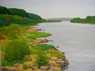
"The Ohio River at Otter Creek Park"--definitely a category A, one of my strongest paintings. This is a scene I've painted several times, and I'll probably paint it again (this is the only one I've painted in the summer--the rest were in the autumn.) I showed it at the Watertower annual show a few years ago. My only regret is that I don't have a little more variety in the green. This is true for many of my paintings.
 Waterfront Towers under construction. An unfortunate category B; I love the idea, and some of the drawing aspects of this are quite nice and interesting. Where it falls apart the most for me is in the areas that should have been the easiest. The red portion of the building at right never looked good, the paint application a little crummy, the color choices are questionable. Also, many of the elements on the ground ended up having a over-simplified, cartoonish feel to them because I was trying to fill them in later based on incomplete sketches and memory. Irritating, because there are some very nice things going on here, too. (about 18x26, oil on canvas)
 A scene in Germantown, near Gnadinger Park. Category A. Once again, I wish I'd put in a little more variety in the green. But I like it. I like the shadows and colors on the houses, and the sense of afternoon sunlight.
 A small (about 8x10) oil painting of a tree. Category A; I'm very fond of this one. The shifty asymmetry of the tree is a lot of fun; there is a strong sense of light and dark, and the colors in the grass glow.
 This painting, a scene along Hwy 22, is from a year-and-a-half ago. It is my most recent real, finished painting. I put it in category A. It's kind of a weird painting because its subject matter isn't what one would call picturesque. I was drawn to the scene, however. The part that I worried would be the hardest to get right, the powerlines and poles, are the nicest parts. I think they are nicely rendered, and there is a good sense of light on the poles. (Size about 18x24, oil on panel)
 "The Ohio River at Otter Creek Park"--definitely a category A, one of my strongest paintings. This is a scene I've painted several times, and I'll probably paint it again (this is the only one I've painted in the summer--the rest were in the autumn.) I showed it at the Watertower annual show a few years ago. My only regret is that I don't have a little more variety in the green. This is true for many of my paintings.


Mark,
ReplyDeleteI'm so glad you posted your paintings like this, along with your comments, which are quite insightful and draw the layperson's eye to points we non-artists wouldn't look for. Of course, I hope you're not so self-deprecatory to potential buyers.
Speaking of commerce, with a painting like the Waterfront Towers, have you considered playing up the "cartoonish" aspects, what with the present commercial popularity of comix and all? Just a thought. I know you're always looking for ways to sell out. Perhaps you could grace the Waterfront Towers with a Sponge Bob-like character, or maybe one of those penguins from "Happy Feet"?
In all earnestness, though, I'm really glad you put your paintings up and presented us with commentary thereon. Kudos, Art-Man.
I can see The Waterfront Towers from my office window. It's fun looking at your painting and looking at it know (Plus, I can see our stadium billboard back there I believe)
ReplyDeleteI'm always drawn to the paintings with the most sky in them. I think it's really interesting, the way you paint the sky. Something very relaxing about the style, the tones.
ReplyDelete